
Risk reporting rarely follows one universal template. One organization uses a standard 5×5 matrix, another needs six impact levels and five likelihood levels, and a third has a completely different set of risk bands. Ultimate Risk Matrix 2.0 for Power BI is built for that reality.
This release gives report authors more control over the structure of the matrix and more ways to explain what is happening inside it. The new version introduces a Full Custom Matrix Builder, rectangular layouts such as 6×5, configurable bands and shapes, a modern tooltip, a flexible legend, animated risk trajectories, and redesigned bubbles.
You can find Ultimate Risk Matrix on Microsoft Marketplace. Existing and prospective users can also consult the Ultimate Risk Matrix 2.0 documentation for detailed configuration guidance.
Latest update: 2.0.0.1 (6 September 2026). Explore the new Detail Cell / Table feature with search, sorting, five custom columns and web links.
Watch Ultimate Risk Matrix 2.0 in action
See the custom Matrix Builder, flexible layouts, risk trajectories, tooltips, legends, and redesigned bubbles in this product walkthrough.
Watch Ultimate Risk Matrix 2.0 on YouTube.
A risk matrix that fits your methodology
The most important change in version 2.0 is the Full Custom Matrix Builder. Instead of adapting an internal risk policy to the visual, report authors can configure the visual around the policy they already use.
Matrix Builder brings the main structural settings together in one place. Choose a fixed square layout, define X-axis and Y-axis values independently, or continue using range-based sizing for an existing report. This makes it possible to build a standard 3×3, 4×4, 5×5, or 6×6 matrix as well as a rectangular matrix such as 6×5.
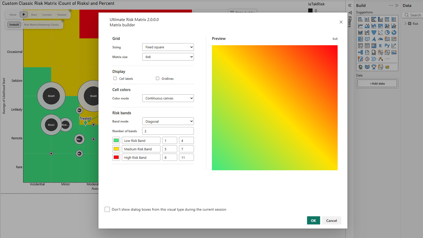
Independent axes are useful when likelihood and impact do not use the same number of levels. They also make migration easier when an established reporting framework cannot be reduced to a square grid without losing meaning.
Configure bands, colors, and shapes with more precision
Risk classification should communicate policy, not just decorate the report. Ultimate Risk Matrix 2.0 supports diagonal, staircase, and interactive custom band modes. Report authors can define and rename up to ten bands, choose band and text colors, and assign individual cells when the organization uses a custom classification model.
The visual also supports band colors, smooth cells, and a continuous canvas. Category-point shapes can follow the resolved risk band or the dataset. That distinction is helpful when a report compares initial, current, residual, and target risk states and viewers need to recognize both severity and stage.

Give viewers useful context with the modern tooltip
A risk marker only tells part of the story. The modern custom tooltip can add the resolved risk band, trajectory information, and selected business fields without overcrowding the matrix itself.
Report authors can choose the standard Power BI tooltip, the ReadyViz custom tooltip, or turn tooltips off. In custom mode, typography, background, transparency, borders, corner radius, shadow, tooltip field limits, and trajectory colors can all be adjusted to match the report design.

Show how risk changes, not only where it ends
A static risk position is useful, but many review meetings are really about movement. Has the risk improved since the initial assessment? Is the target realistic? Which risks have moved in the wrong direction?
Dynamic trajectory animation makes those changes easier to follow. Report authors can animate all datasets or a selected dataset, set the duration, show movement lines, use a layered-comet or full-path presentation, and choose a finite number of loops or continuous playback. Markers can also morph between configured stage shapes.
The redesigned legend supports path, statistics, and bubble sections. Section titles, stage descriptions, Impact and Likelihood labels, field labels, typography, background, borders, and transparency can be configured so the explanation fits the report rather than competing with it.

For accessibility and predictable exports, animation is disabled when reduced motion is requested and during export. Labels and static path cues therefore remain important parts of the design.
New bubble designs for detailed and aggregated reporting
Version 2.0 separates two related visualization needs. Individual category points can use the new Core + Ring design, with independent control over the outer ring, inner core, borders, transparency, size, and optional labels.
The classic aggregated Risk Bubble view remains available for cell-level summaries. Bubbles can scale by count and display the count, percentage, or both. This is often the clearer choice for executive heatmaps or large risk registers where several items occupy the same matrix cell.

New in 2.0.0.1: Detail Cell / Table turns a matrix cell into a risk review
Update: 6 September 2026. The new cell detail table connects the Classic heatmap overview with the individual risks behind it. Select an occupied cell or its +N marker to open a docked table below the matrix—without adding another visual to the report.
Imagine a review meeting where several risks share a high-impact cell. Instead of stopping at the count, open the table, search for an owner, sort by review date and follow the link to the risk register. The matrix remains the starting point, while the table supplies the context needed for the next action.
One row per risk, with phase values side by side
Impact and Likelihood compare each risk’s bound phases in the order printed above the table, such as Start / Current / Treated. Values like 5 / 4 / 2 show the progression in one row, even when the other phases lie in different cells. Missing phases show a dash. Size is shown once per risk using the first populated phase value, and Risk Band identifies the inspected position’s band.
Five custom columns, search and sortable headers
- Add up to five Custom information fields: for example owner, mitigation status, review date, business unit and a risk-register URL. Each field becomes its own column.
- Search the cell’s risks: search matches risk names and custom-information values.
- Sort any visible column: click a header to switch between ascending and descending. Numeric and date fields sort by their underlying values; blanks remain last.
- Browse the complete matching list: sorting happens before pagination, with 100 risks per page.
- Open web links: valid HTTP/HTTPS values become clickable when Clickable URLs is enabled and the host supports them. Opening a link does not select the risk.
- Choose the presentation: independently show or hide Risk, Impact, Likelihood, Size and Risk Band, and set table text size from 8 to 24.
How to enable it
Use Risk Matrix/Heatmap Classic, bind a Risk (category) field and keep Risk Bubbles > Configuration > Show cell details on selection enabled. Configure columns and links under Risk Bubbles > Cell details. The table works with Custom, Power BI or Off tooltips; Custom information fields remain table-only unless also bound to Tooltips.
Select a risk to use Power BI report interactions, with Ctrl/Cmd for multiple selection. Close the panel with × or Escape without clearing the report selection. In All positions mode, cell totals count risk/phase positions, whereas table rows count distinct risks—so those counts can legitimately differ.
The same update adds compact, responsive custom tooltips and Full / Auto / Light animation effects. Auto reduces decorative effects for dense trajectories while retaining the risk values and final positions.
See the Detail Cell / Table documentation for field mapping, defaults, sorting behavior and troubleshooting.
Designed for real risk review workflows
Together, these changes make Ultimate Risk Matrix 2.0 more useful across operational reviews, project and portfolio reporting, audit and compliance dashboards, enterprise risk management, and board-level reporting. The goal is not to impose another scoring model. It is to make the organization’s existing model clearer, more interactive, and easier to discuss in Power BI.
- Build square or rectangular matrices that match the approved scoring framework.
- Use up to ten named bands for more precise classification.
- Differentiate risk states through shapes, colors, tooltips, and legends.
- Show movement between initial, current, residual, and target positions.
- Switch between detailed category points and aggregated risk bubbles.
Get Ultimate Risk Matrix 2.0
Open Ultimate Risk Matrix on Microsoft Marketplace, explore the available ReadyViz license tiers, or follow the version 2.0 documentation.
For a longer visual walkthrough and additional screenshots, read the companion article on datadriven.pro.
Frequently asked questions
Can Ultimate Risk Matrix create a 6×5 matrix in Power BI?
Yes. Matrix Builder supports independent X-axis and Y-axis values, so the two axes can contain different numbers of levels.
How many custom risk bands are supported?
Report authors can define and rename up to ten risk bands and configure their colors and cell assignments.
Can the visual animate movement between risk states?
Yes. Dynamic trajectory animation can show movement between datasets or stages with configurable duration, movement-line style, colors, and looping.
Where can I find the complete settings reference?
The Ultimate Risk Matrix 2.0 documentation covers Matrix Builder, tooltips, legends, trajectories, bubbles, recommended defaults, and troubleshooting.