Ultimate Risk Matrix
Ultimate Risk Matrix 2.0 for Power BI — Documentation
Ultimate Risk Matrix 2.0 helps Power BI users build square or rectangular risk matrices, define organization-specific bands, compare risk states, and explain movement with configurable tooltips, legends, bubbles, and animated trajectories.
Product details
- Product
- Ultimate Risk Matrix
- Publisher
- ReadyViz.com
- Platform
- Microsoft Power BI custom visual
- Version
- 2.0.0.1
- Last reviewed
- 6 September 2026
Featured: Ultimate Risk Matrix 2.0
Start here: See the latest Matrix Builder, custom layouts, tooltips, legends, trajectories, and bubble design in action.
Additional walkthrough
The original Ultimate Risk Matrix walkthrough remains available as an additional guide.
What’s new in Ultimate Risk Matrix 2.0
Version 2.0.0.1: Adds the Detail Cell / Table with five custom-information fields, sorting, clickable URLs and presentation controls, plus compact tooltips, animation effects and report-integration improvements.
Version 2.0 adds a Full Custom Matrix Builder, independent X and Y layouts such as 6×5, up to 10 named bands, shape assignment by risk band or dataset, a modern tooltip, a configurable legend, dynamic trajectory animation, and redesigned category points and risk bubbles.
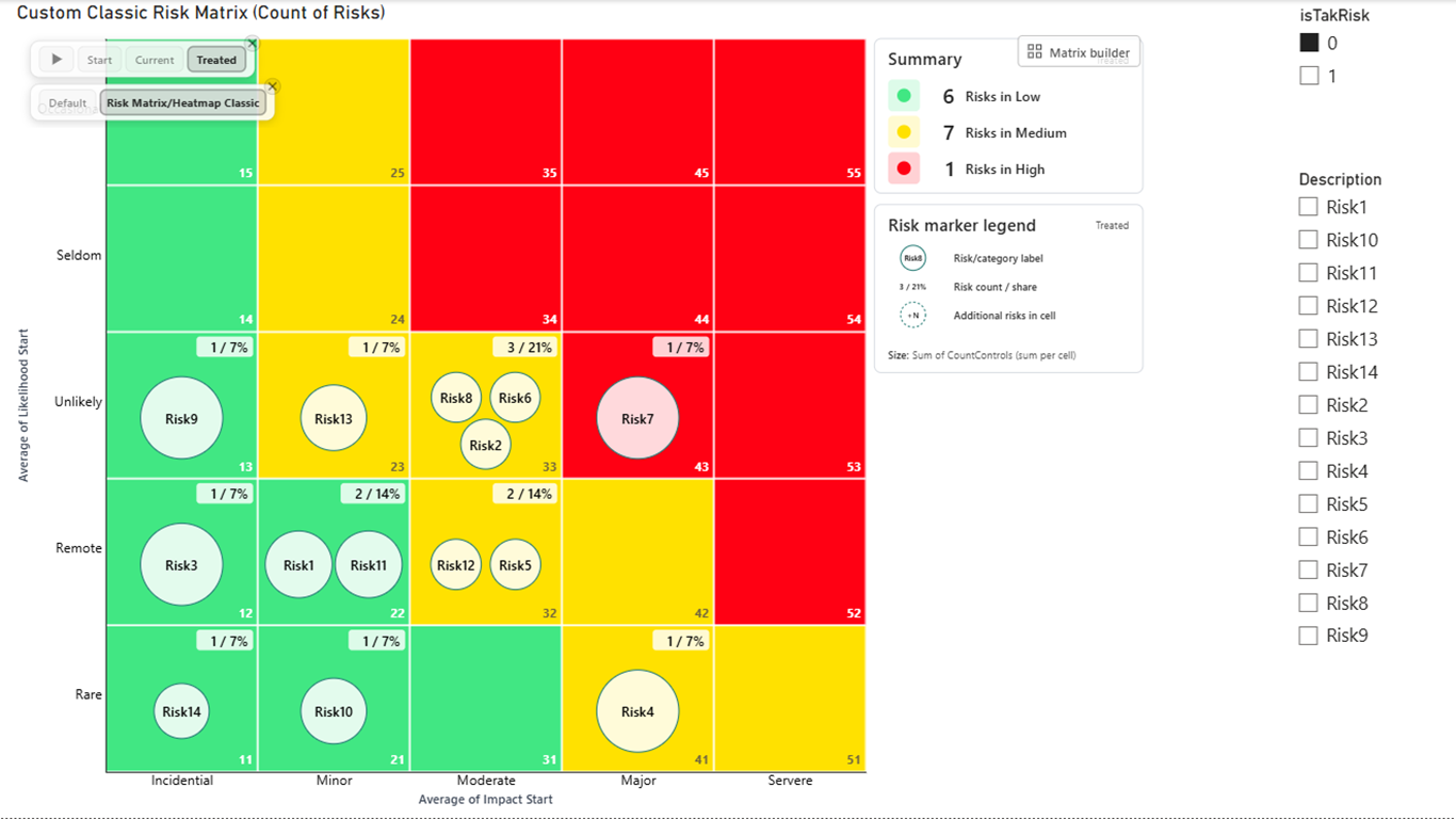
Overview
The Ultimate Risk Matrix visual turns risk scoring data into a clear Power BI risk matrix for risk registers, project dashboards, safety reviews, IT risk reporting, engineering assessments, and business governance reports. Use this section as practical risk matrix Power BI documentation for setup, field mapping, and interpretation.
A risk matrix usually compares Likelihood, meaning how probable it is that a risk will occur, with Impact, meaning how severe the consequences would be if the risk occurs. Report authors can configure matrix size, axis ranges, labels, risk bands, colors, fonts, gridlines, marker styles, chart type, category-point shape assignment, dataset pickers, and risk bubble labels with percentage precision.
When to use Ultimate Risk Matrix
- Visualizing risks by likelihood and impact.
- Prioritizing a risk register into low, medium, and high bands.
- Comparing initial, current, residual, or target risk scores.
- Showing several risk measures in one report visual.
- Switching between detailed category points and aggregated risk bubbles with the chart type picker.
- Displaying individual risks by category for transparent review.
- Aligning risk reporting with a business-specific scoring methodology.
Do not use it as
- The only source for safety-critical, financial, compliance, or operational decisions.
- A replacement for formal risk assessment methodology.
- A substitute for risk owner review or governance approval.
- A way to compare risks unless the underlying scoring scale is consistent.
Quick start
- Install the visual. In Power BI Desktop or the Power BI service, open your report, go to the Visualizations pane, select the ellipsis, choose Get more visuals, select AppSource visuals, search for Ultimate Risk Matrix, and select Add.
- Add the visual to the report canvas. Select the Ultimate Risk Matrix icon in the Visualizations pane.
- Bind your data. Add the fields or measures that represent the X-axis and Y-axis values, Impact (X) and Likelihood (Y).
- Add a Risk field. Use a risk name, risk ID, asset, project, process, or other category field when each risk should appear individually. A Risk (category) field also enables the chart type picker.
- Choose a chart type. In Format visual > Chart Render, choose Default for individual category points or Risk Matrix/Heatmap Classic for aggregated risk bubbles. Use Show chart type picker when report viewers should switch modes on the canvas.
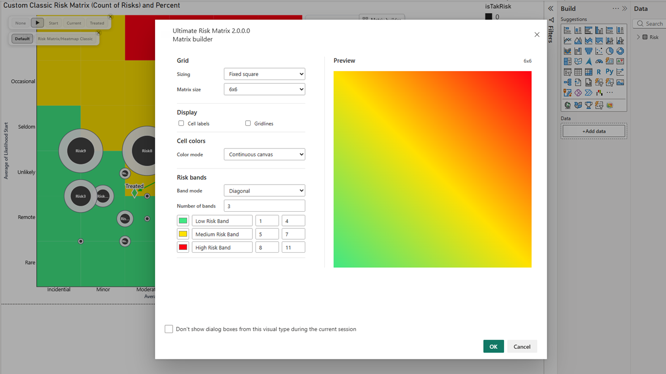
- Open Matrix Builder. Choose Fixed square for 3×3, 4×4, 5×5, or 6×6; Independent axis values for a rectangular layout such as 6×5; or Axis ranges for the legacy range-based configuration.
- Configure risk bands. Choose Diagonal, Staircase, or Custom (Interactive), then adjust colors and boundaries to match your policy.
- Customize axes and labels. Set axis titles, tick labels, custom labels, fonts, and colors.
- Style markers and category points. Choose marker and point shapes, sizes, colors, transparency, and dataset-specific overrides for multiple X/Y pairs. For category points, use Assign shapes by to switch between risk-band shapes and per-data-pair dataset shapes.
- Configure risk bubbles. In Risk Bubbles, choose count, percentage, or both for bubble labels, set decimal places for percentages, and optionally show a dataset picker when multiple X/Y pairs are bound.
- Configure explanation and movement. Choose Power BI, Custom, or Off for the tooltip; configure the legend; and enable trajectory animation when viewers should see movement between risk states.
- Review before publishing. Confirm that plotted risks, labels, and low/medium/high bands match your organization’s scoring rules.
Data requirements and preparation
Each plotted point should have a numeric X value and a numeric Y value. The built-in comparison and detail views treat X as Impact and Y as Likelihood. Bind the matching scores consistently across all phases.
| Field | Purpose | Example |
|---|---|---|
| Risk ID or risk name | Identifies each risk. | R-014, Supplier outage |
| Risk (category field well) | Defines the risk identity used for counts, details and selection. Use unique risk names or IDs for per-risk reporting. | R-014: Supplier outage |
| X-axis score | Horizontal matrix position (Impact). | Impact = 4 |
| Y-axis score | Vertical matrix position (Likelihood). | Likelihood = 5 |
| Additional X/Y pairs | Compares multiple states or measures. | Initial, Current, Target |
| Risk owner | Useful for tooltips, filters, or drill-through pages. | Operations Manager |
| Status or lifecycle stage | Distinguishes active, mitigated, monitored, or closed risks. | Active |
| Custom information (up to five fields) | Separate searchable cell-detail columns; optional web links. | Owner, status, review date, business unit, risk URL |
| Size | Optional numeric measure for scaling category points or aggregated risk bubbles. | Exposure value, expected loss |
Understanding the visual
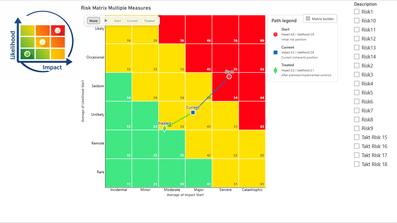
The matrix background divides the chart into cells. Each cell represents a score combination, such as Likelihood 3 and Impact 4. Matrix cells can be styled as low, medium, or high risk bands.
| Band mode | Best for | How it works |
|---|---|---|
| Diagonal | Standard risk matrices where risk level increases diagonally. | Uses diagonal ranges to divide cells into low, medium, and high bands. |
| Staircase | Policy models with step-based thresholds. | Uses comma-separated boundary profiles for Low → Medium and Medium → High transitions. |
| Custom (Interactive) | Organization-specific risk maps. | Lets report authors assign custom bands interactively when the band picker is enabled. |
| Chart type | Best for | How it works |
|---|---|---|
| Default | Detailed risk registers and state comparisons. | Plots individual category points and optional markers/connectors for each X/Y pair. |
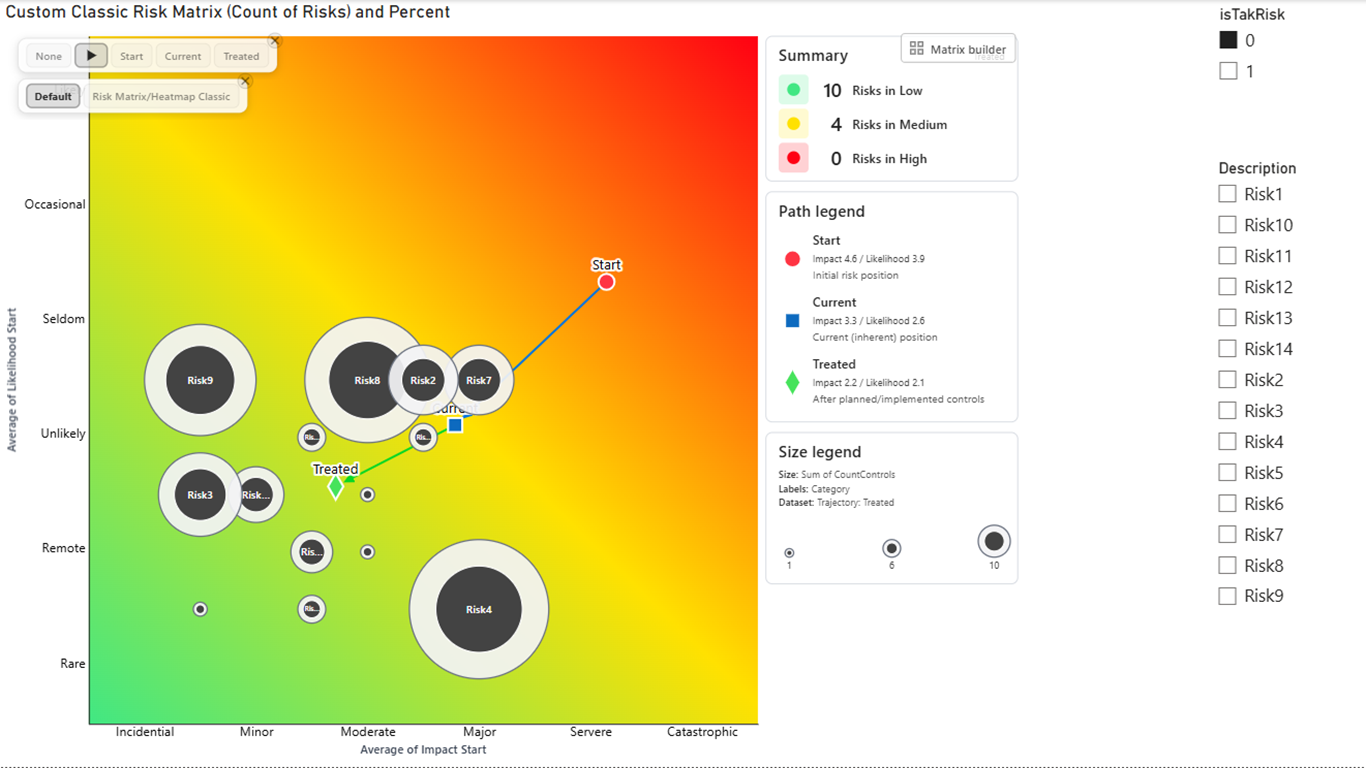
| Risk Matrix/Heatmap Classic | Executive heatmaps and crowded risk registers. | Aggregates risks into bubbles per matrix cell. Bubble labels can show count, percentage, or both. |
Format pane settings
Chart Render
Choose the chart type: Default for individual category points or Risk Matrix/Heatmap Classic for aggregated risk bubbles. Turn Show chart type picker on when viewers should switch chart types directly on the report canvas. The picker is available when a Risk (category) field is bound.
X-axis
Represents Impact in the built-in comparison views. Configure minimum, maximum, step, tick values, title text, title style, and optional custom labels from 0 through 10.
Y-axis
Represents Likelihood in the built-in comparison views. Configure start, end, step, values, title text, title style, and optional business labels such as Negligible, Minor, Moderate, Major, or Severe.
Matrix Builder
Choose Fixed square, Independent axis values, or Axis ranges (legacy). Fixed square offers 3×3, 4×4, 5×5, and 6×6. Independent values let the X and Y axes use different lists, including rectangular layouts such as 6×5. Configure cell labels, gridlines, band mode, color mode, band names, colors, and interactive cell assignments in one builder.
Risk bands
Choose Diagonal, Staircase, or Custom. Define and rename up to 10 bands, set band and text colors, or use Smooth cells or Continuous canvas color modes. In Custom mode, use the band picker to paint cells according to the organization’s policy.
Marker
Choose marker type, size, fill color, transparency, border, connectors, labels, and per-dataset overrides for multiple X/Y pairs.
Point and shapes
Set Assign shapes by to Risk band when category-point shape should follow the resolved band, or Dataset when each X/Y pair should have its own shape. Available shapes include circle, cross, diamond, rectangle, square, star, triangle, and wye. The Core + Ring design adds configurable ring and core fill, transparency, borders, size, and optional category or size labels.
Modern tooltip
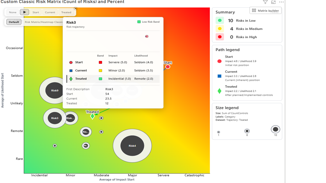
Choose Power BI, Custom, or Off. The Custom tooltip can show trajectory details, the resolved risk band, and additional tooltip fields. Configure Maximum tooltip fields, typography, background, transparency, border, corner radius, shadow, and trajectory colors.
Legend
Show or hide path, statistics, and bubble legend sections. Edit section titles, Impact and Likelihood labels, stage descriptions, field labels, typography, background, border, corner radius, and transparency.
Trajectory animation
Select All datasets, an individual dataset, or None for points. Configure duration, movement lines, layered-comet or full-path rendering, stage or custom colors, and a finite loop count or continuous looping. Marker shapes can morph between configured stages.
Cell details
In Classic mode, enable Risk Bubbles > Configuration > Show cell details on selection. Under Cell details, configure Risk, Impact, Likelihood, Size and Risk Band columns, Table text size (8–24) and Clickable URLs. Bind up to five Custom information fields for additional columns. Read the complete table guide.
Risk Bubbles
Controls aggregated Risk Matrix/Heatmap Classic bubbles separately from Core + Ring category points. Configure size, fill, transparency, border, scaling, dataset picker, and labels showing Count, Percentage, or Both with 0–6 decimal places.
Label names
Rename dataset labels used in legends, tooltips, labels, or dataset selection depending on report context. Use friendly names such as Initial risk, Current risk, or Target risk.
Full Custom Matrix Builder and rectangular layouts
- Open Format visual > Matrix and launch Matrix Builder.
- Choose Independent axis values when the horizontal and vertical scales differ.
- Enter the X-axis values and Y-axis values independently—for example, six impact values and five likelihood values for a 6×5 matrix.
- Choose Diagonal, Staircase, or Custom band mode, then select Band colors, Smooth cells, or Continuous canvas.
- Rename bands, set colors, and use the interactive picker to assign cells when the organization uses a custom policy.
- Review labels and gridlines before closing the builder.
Detail Cell / Table: inspect the risks behind a Classic cell
The Classic matrix combines a cell-level overview with a docked, searchable risk table. Select an occupied cell or its +N overflow marker to inspect the underlying risks without adding a separate table visual. This feature is available in Risk Matrix/Heatmap Classic, not the Default category-point view, and works independently of the tooltip mode.
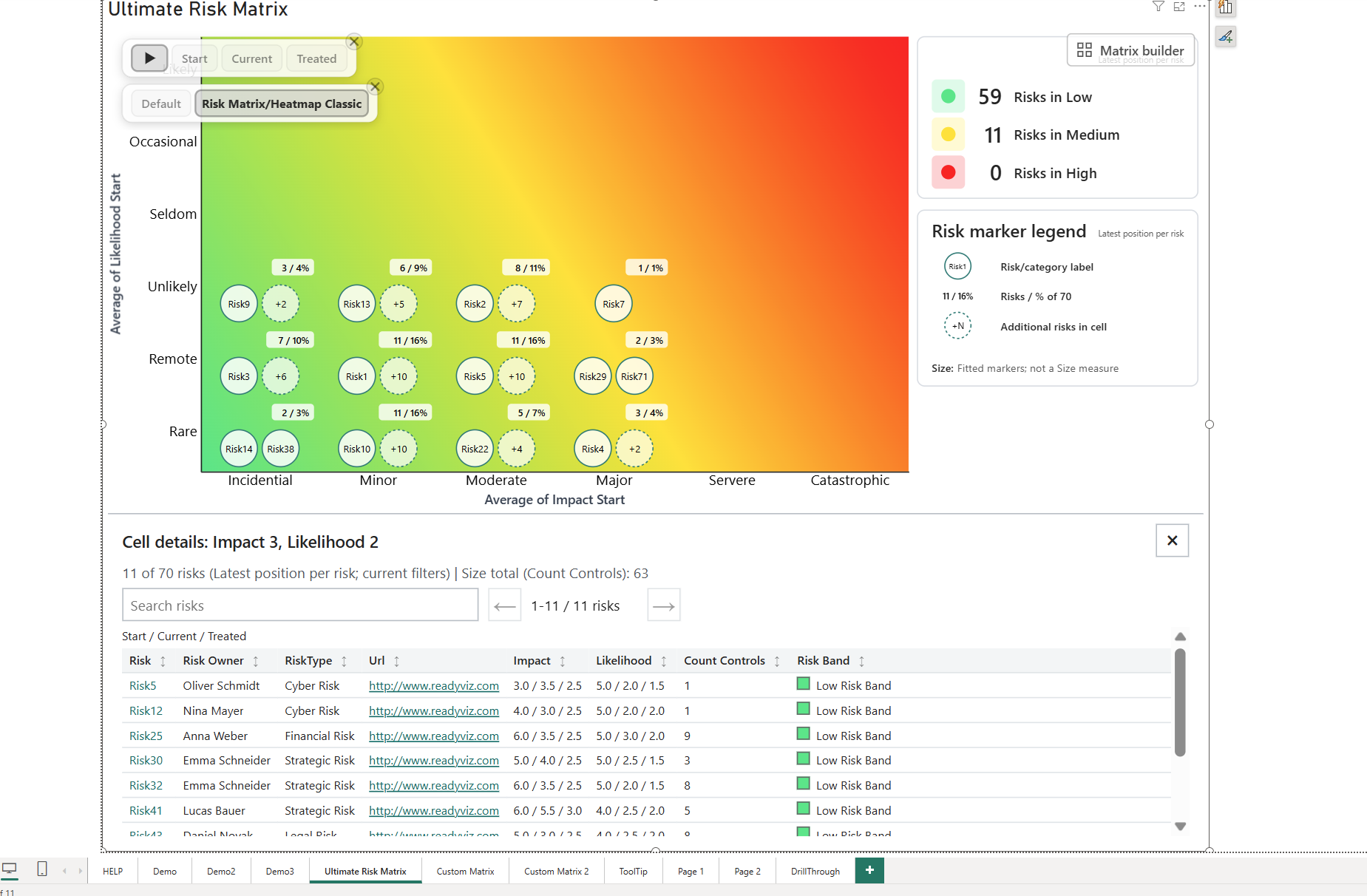
Open and configure the table
- Bind a Risk (category) field that identifies your risks, plus the relevant Impact (X) and Likelihood (Y) pairs.
- Select Chart Render > Risk Matrix/Heatmap Classic and enable Risk Bubbles.
- Keep Risk Bubbles > Configuration > Show cell details on selection enabled; it defaults to On.
- Select an occupied matrix cell or its +N marker. The table opens below the chart inside the visual.
- Use Risk Bubbles > Cell details to choose the standard columns, table text size and whether web addresses are clickable.
| Setting | Default | Behavior |
|---|---|---|
| Risk column | On | Shows the risk name as a selection button. When hidden, the row itself remains selectable. |
| Impact column / Likelihood column | Both On | Compare values across bound phases in the order shown above the table. |
| Size column | On | Appears when a finite Size value is available, using the bound measure name. Shows one value per risk. |
| Risk Band column | On | Shows the inspected position’s band name and color swatch. |
| Table text size | 12 | Accepts 8–24 and applies to table headers, values and the phase caption. |
| Clickable URLs | On | Opens valid absolute HTTP/HTTPS addresses in Custom information cells through Power BI when activated. |
| Custom information | No fields bound | Add up to five fields in the data field well. Each becomes a separate column after Risk, in binding order. |
Add business context with up to five custom fields
Drag fields such as Risk owner, Mitigation status, Review date, Business unit and a risk-register URL into Custom information. Use a measure or a suitably summarized column (for example First/Last for text) that returns the intended value for each risk. Column headers use the bound field names; model formatting is preserved and blank values show a dash. Reorder or remove field bindings to reorder or remove these columns.
Custom information is table-only: it does not automatically populate hover tooltips. Bind a field separately to Tooltips if it should also appear there. Custom-information bindings do not create extra risk-grouping levels.
Read the phase comparison correctly
The table contains one row per distinct risk in the inspected cell. Impact and Likelihood compare all loaded, bound phases for those risks—even if a risk’s other phase positions are in different cells. The caption defines the order, for example Start / Current / Treated. An Impact value of 5 / 4 / 2 follows that order. Missing phases show a dash; zero remains visible.
Size is displayed once per risk, using the first populated phase value, rather than summing repeated phase values. The panel’s separate Size total is the selected cell’s aggregate and can differ from a sum of the displayed unique-risk rows, especially in All positions mode. Signed totals are retained. Numeric comparisons use model formatting and the Tooltip > Numbers > Decimal places setting.
Search, sort, page and select
- Search: Search risks matches risk names and all bound Custom information values, including complete text that is visually shortened.
- Sort: Activate any visible column header to sort ascending; activate it again for descending. Sorting applies to the complete matching list before pagination and returns to page one.
- Sort values: Numeric and date custom fields use their underlying values, not formatted text. Impact and Likelihood compare phase values in caption order; Size uses its displayed first-available value. Blank values stay last in either direction.
- Page: Previous/Next controls navigate pages of 100 risks. The status shows the visible range and matching risk count.
- Select: Click a risk name, or the row when Risk is hidden, to select it in Power BI. Ctrl/Cmd adds to the selection; report interactions follow the report’s configured behavior.
- Open links: Click a valid web address or focus it and press Enter. Opening a link does not select its risk row. Other address types and invalid addresses remain plain text; links also remain text when disabled or unsupported by the host.
- Navigate: Keyboard users can reach search, page controls, sortable headers, risk buttons and links. Close with the × button or Escape; focus returns to the chart and the report selection is retained.
Columns size to their content. Narrow panels scroll horizontally; long risk names and custom values are shortened with full hover text. Search, sorting and paging operate within the currently inspected cell. Details refresh with data and size changes, but close if the cell disappears, the dataset/grid changes or the chart switches to Default. The open panel itself is not stored in bookmarks.
Understand cell counts and +N
Classic risk markers fit the available cell space; +N exposes risks that do not fit. These fitted individual marker diameters indicate readable placement, not a Size measure. Aggregate bubbles retain their separate sizing controls.
- Single dataset: Counts risks in the chosen phase.
- Play trajectory (latest positions): Counts each risk at its latest available phase.
- All positions: Counts loaded risk/phase positions. Select this mode in the formatting pane; it is not an option in the compact on-chart picker.
The table and its pagination count distinct risks, while an All positions cell total can count multiple positions for one risk. Percentages use the loaded data in the active scope after current filters, not just the selected risks or every record in the model. Drawing limits do not remove loaded risks from the detail list.
Other changes in 2.0.0.1
Compact tooltips
Custom tooltips have a maximum width of 340px. Additional fields use aligned label/value pairs in two columns when space permits and fall back to one column in narrow views or with larger text. Maximum tooltip fields controls the number of additional fields, not visual rows. Multi-risk cell previews show a compact phase comparison with up to eight risk rows, reduced to fit available height; use the cell detail table for the complete list.
Animation effects for dense reports
Both point and Classic animation settings offer Animation effects: Full (default) retains the complete effects; Light omits layered glow/head effects; Auto uses Full for up to 300 risk-stage segments and Light above that threshold. The setting changes decorative effects, not risk values or final positions. Choose Auto or Light when a dense animated report needs a simpler presentation. Queued trails no longer show premature dots at future stage positions.
Measure-driven text and colors
Plain display-text settings and color pickers support global fx bindings. Use text measures for titles, descriptions, band names and dataset labels; use a color-string measure such as #126A73 with Field value for colors. These are global setting values, not per-risk conditional colors. Structural inputs such as axis-value lists and custom matrix assignments are not display-text bindings. Matrix Builder preserves unchanged text/color bindings when saving unrelated edits.
Labels, formatting and accessibility
New reports use size 8 for risk, count, point and aggregate-marker labels; saved report overrides remain in effect. Axis custom labels default to On, while numeric fallback remains available for empty labels. Tooltip numbers honor model formats, with an optional 0–6 decimal-place override. Keyboard selection and bookmark selection restoration are supported independently of tooltip mode. High-contrast themes use the host palette and severity patterns; normal-mode severity indicators and canvas band codes default to Off.
Modern tooltip
Use Power BI for the standard host tooltip, Custom for the ReadyViz tooltip, or Off when no hover panel is needed. The custom mode can display the current risk band, trajectory information, and additional tooltip fields.
- Set Maximum tooltip fields from 1 to 20; the default is 6. Fields may share a visual row.
- Configure typography, background, transparency, border, corner radius, and shadow.
- Use dataset or custom trajectory colors.
- Tooltip trajectory animation supports durations from 0.2 to 5 seconds and respects reduced-motion preferences.
Legend and dynamic trajectory animation
The legend can explain path stages, statistics, and bubble values without forcing report viewers to infer the visual language. Edit section titles, stage descriptions, Impact and Likelihood labels, field labels, typography, background, borders, and transparency.
For trajectories, choose all datasets, one dataset, or none; set the duration from 0.5 to 60 seconds; and show layered-comet or full-path movement lines. Loops can run a fixed number of times or continuously. Use stage colors or custom colors, and allow markers to morph between configured shapes.
New bubble designs
Ultimate Risk Matrix 2.0 contains two related but separate bubble configurations:
- Category points — Core + Ring: Configure ring fill, transparency, and border; core size, color, transparency, and border; and an optional Category, Size, or Both label.
- Aggregated Risk Bubbles: Configure bubble size, fill, transparency, border, scaling by count, and labels showing Count, Percentage, or Both.
Practical setup examples
Standard 5x5 risk map
- Set Matrix Size to 5x5.
- Keep Band mode as Diagonal.
- Configure low, medium, and high band ranges.
- Keep axis titles visible and label axes Likelihood and Impact.
Rectangular 6×5 risk matrix
- Open Matrix Builder.
- Choose Independent axis values.
- Enter six X-axis values and five Y-axis values.
- Review cell labels, bands, and shapes against the approved risk policy.
Business-specific scoring labels
- Enable X-axis and Y-axis custom labels.
- Map numeric scores to business terms such as Very Low, Low, Medium, High, and Very High.
- Confirm label position aligns with matrix cells.
Multiple datasets comparison
- Bind multiple X/Y measure pairs such as initial, current, and target risk.
- Assign unique marker shapes and colors to each dataset.
- For category points, set Assign shapes by to Dataset when each data pair should use a different point shape.
- Use friendly dataset label names.
Classic risk bubble heatmap
- Add a Risk (category) field.
- Open Chart Render and choose Risk Matrix/Heatmap Classic.
- Set Risk Bubbles > Label content to Count, Percentage, or Both.
- Use Decimal places to control percentage precision from 0 to 6 digits.
Custom organization risk policy
- Set Band mode to Custom (Interactive).
- Turn on Show band picker.
- Assign cells to low, medium, or high risk according to internal policy.
- Review with the risk governance owner before publishing.
Recommended defaults for first-time users
Report design and accessibility tips
- Use both color and labels; do not rely on color alone.
- Choose marker and point colors that remain visible on low, medium, and high risk bands.
- Use the classic risk bubble chart type when many risks overlap in the same matrix cells.
- Keep risk band labels short enough to fit inside matrix cells.
- Use consistent axis ranges across pages when viewers compare visuals.
- Add tooltips for risk owner, mitigation status, due date, or residual risk notes.
- Validate the matrix with the policy owner before publishing to a broad audience.
Troubleshooting
| Issue | Likely cause | What to check |
|---|---|---|
| Cell detail table does not open | Wrong chart mode, missing Risk field or disabled details. | Use Classic, bind Risk, enable Risk Bubbles and Show cell details on selection, then select an occupied cell or +N. |
| Table says No columns selected | All standard columns are hidden and no custom fields are bound. | Enable columns under Risk Bubbles > Cell details or bind Custom information. |
| Custom field is missing from a tooltip | Custom information is table-only. | Bind the field separately to Tooltips. |
| URL appears as plain text | Link switch off, invalid/non-web URL or unsupported interactions. | Use an absolute HTTP/HTTPS address, enable Clickable URLs and check in an interactive Power BI host. |
| Cell count differs from table row count | All positions counts phases; the table lists distinct risks. | Check the active dataset scope and clear the table search before comparing counts. |
| No points appear | Missing or nonnumeric X/Y values. | Confirm that both axes have numeric fields or measures. |
| Points appear outside expected cells | Axis range or step does not match the scoring scale. | Check X-axis and Y-axis minimum, maximum, and step settings. |
| Matrix size does not match the score range | The wrong Matrix Builder sizing mode is selected. | Use Fixed square for 3×3 through 6×6, Independent axis values for layouts such as 6×5, or Axis ranges for legacy range-based sizing. |
| Custom labels do not appear | Custom labels are disabled or value is outside 0..10. | Turn on Use custom labels and confirm that the tick value has a matching custom label. |
| Dataset-specific marker or point settings are missing | Only one X/Y pair is detected, or point shapes are still assigned by Risk band. | Add multiple X/Y pairs, then set Point > Shape > Assign shapes by to Dataset for per-data-pair category point shapes. |
| Chart type picker does not appear | No Risk (category) field is bound or Show chart type picker is off. | Add a Risk (category) field and enable Format visual > Chart Render > Show chart type picker. |
| Risk bubble percentages have too many or too few decimals | Decimal places is not set for percentage labels. | Set Risk Bubbles > Configuration > Label content to Percentage or Both, then adjust Decimal places from 0 to 6. |
| Risk bands do not match policy | Band mode or boundaries are not configured correctly. | Review diagonal ranges, staircase boundaries, or custom band assignments. |
| Custom tooltip is missing fields | Tooltip mode, additional fields, or Maximum tooltip fields is not configured. | Choose Custom tooltip, add the required tooltip fields, and increase Maximum tooltip fields if needed. |
| Trajectory does not animate | No dataset is selected, animation is disabled, the visual is exporting, or reduced motion is active. | Review the trajectory dataset, loop, and duration settings and test in an interactive report view. |
| Legend omits a section | Path, statistics, or bubble legend display is disabled. | Open Legend and enable the required section, then review its title and field labels. |
| Markers are hard to see | Marker color, transparency, or border settings reduce contrast. | Increase marker size, reduce transparency, or enable a contrasting border. |
| Visual cannot be added | Marketplace, tenant, or admin restriction. | Ask your Power BI administrator whether AppSource visuals are allowed for your tenant. |
Glossary
Risk matrix: A grid used to classify risks by two dimensions, commonly likelihood and impact.
Risk heatmap: A compact visual name often used for a risk matrix when teams want to discuss exposure by likelihood, impact, and severity in steering committees or executive reviews.
Likelihood: The probability or frequency of a risk occurring. Impact: The severity of consequences if the risk occurs.
Risk band: A named visual classification such as low, medium, or high risk. Matrix Builder: The configuration dialog for sizing, axis values, band modes, color modes, labels, gridlines, and interactive cell assignments.
Rectangular matrix: A matrix with different horizontal and vertical cell counts, such as 6×5, created with independent axis values.
X/Y pair: A pair of numeric values used to plot one dataset or risk state. Dataset-specific override: A marker shape, color, connector, label, or category-point shape setting that applies to a specific X/Y pair.
Chart type picker: An optional on-canvas control for switching between Default category points and Risk Matrix/Heatmap Classic bubbles when a Risk (category) field is present.
Risk bubble: An aggregated circle drawn per matrix cell. It can show risk count, percentage of visible risks, or both, with configurable percentage decimal places.
Core + Ring: A category-point design with separately configurable outer ring and inner core. Trajectory: A path showing movement between risk states or datasets.
References and source notes
Reviewed against version 2.0.0.1 on 6 September 2026: report-integration source snapshot. This guide describes that build’s features; the version currently delivered through Marketplace may differ.